
Brave Explorer
Course
Application Design II
Team
Johanna Schopf, Lea Voith
Supervision
Rebecca Schellhorn
Grade
1,0
The existing Outdooractive app offered many useful functions for hikers, cyclists and mountaineers, but its content structure was overloaded and difficult to access. Key issues included too many hierarchy levels, weak features, poor navigation and a Discover page that did not create any interest.
The goal was to rethink and improve the mobile application through a structural, strategic and visual redesign, with a focus on selected delight features that make the app more user-centered.
Using design thinking methods, the existing app was analyzed through SWOT, Kano Model, feature prioritization and design filters. Based on a persona and user need statement, low- and high-fidelity prototypes were created and tested around the scenario of planning hiking routes collaboratively with friends.
The result is a strategic redesign that improves route discovery, collaborative planning, groups and chats, suggests points of interest and offers a more personalized Discover experience.
The project strictly followed the classic design thinking process, which provided the framework for a targeted redesign that was developed iteratively and tested with a wide range of potential users.
Empathize
Define
Ideate
Prototype
Test
Implement
Within the design thinking process, there are several methods that helped us gain a clear understanding of the existing application, identify problems, and determine its potential. These improvements were then categorized and incorporated into the redesign based on their priority.
Analysing the app’s strengths, weaknesses, and opportunities helped identify key issues and areas for improvement.
Potential and existing features were mapped in a Kano model to understand how they meet user needs.
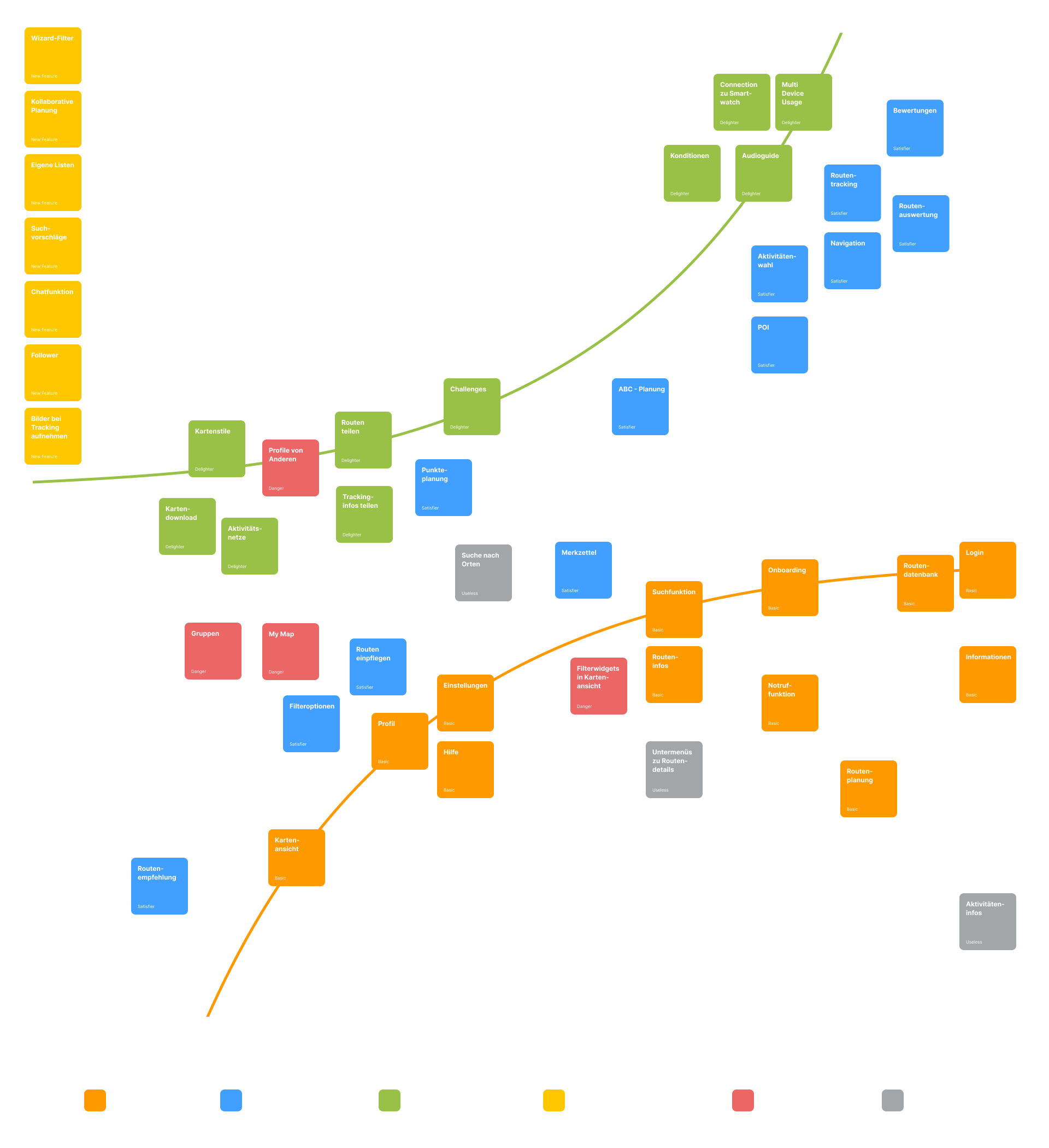
Identified features were evaluated by type, current state, and impact on user satisfaction.

Before redesigning the app, core attributes were defined to guide its look, feel, and behavior.
The existing application had too many hierarchical levels, and its community features failed to serve their purpose due to poor design and a lack of empathy. In addition, the main navigation was very repetitive, and pages like the Discover page were uninspired and detracted from the user experience.
Too many hierarchy levels
Community features poorly developed
Many nav items show the same map view
Discover Page arouses no interest
How might we enable Max and his friends to plan routes collaboratively?
How might we provide Max with personalized route suggestions?
How might we allow Max to personalize existing routes?
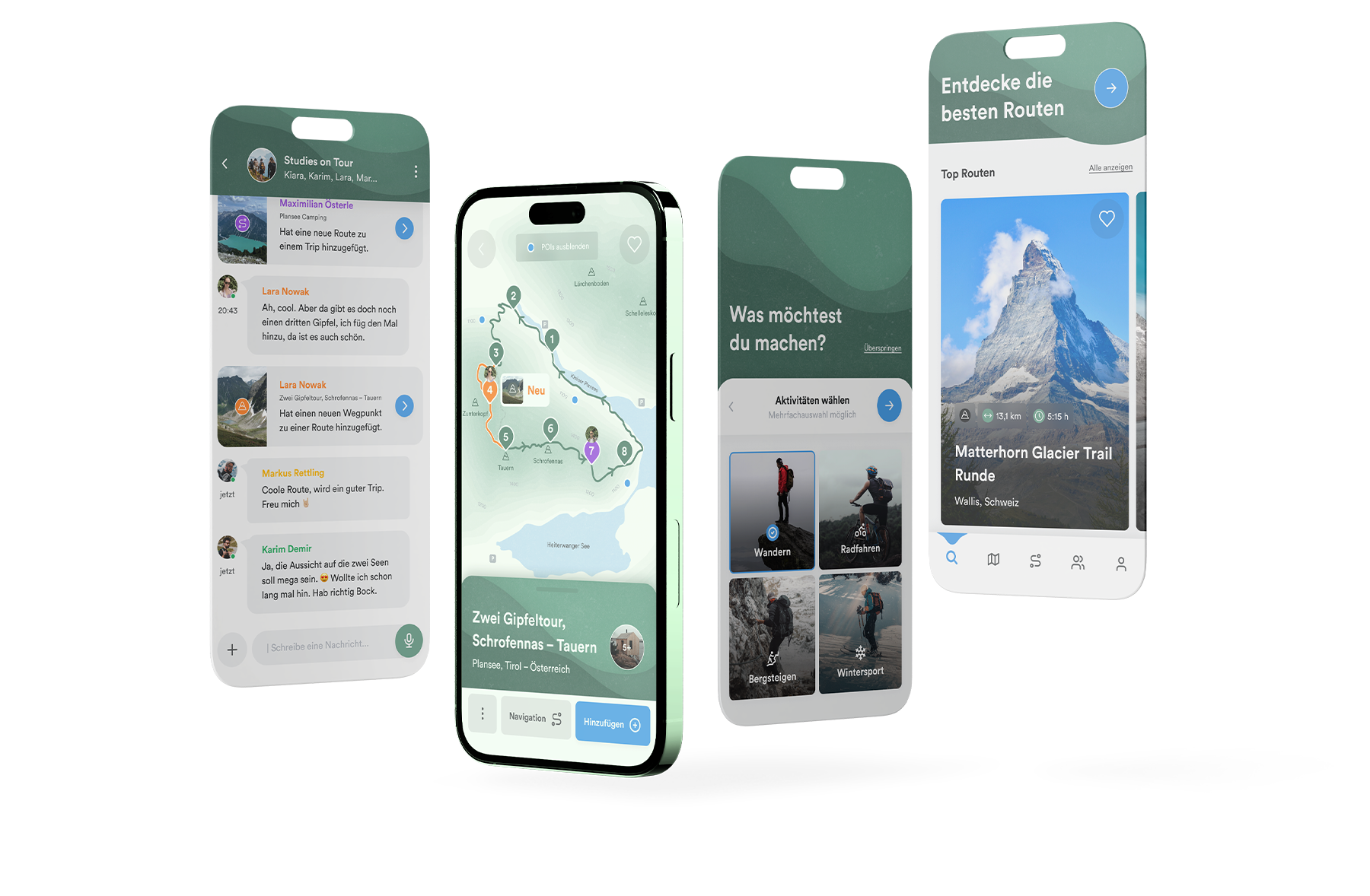
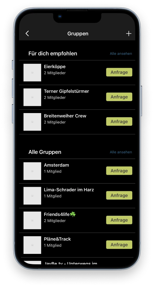
When we tested the existing app, in addition to many confusing errors in the information architecture, we noticed that we were missing one thing in particular – A possibility to collaborate with each other.
Through the new community, like-minded people can connect, create groups, take part in challenges and challenge each other.

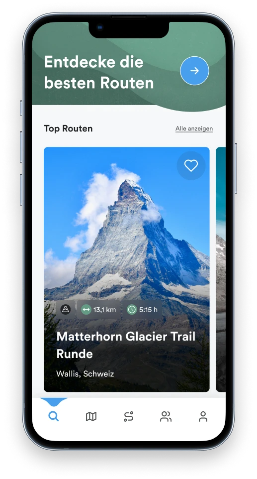
You rarely go hiking alone. With the new tool for collaborative planning, several users can plan their tours together and bring more variety to their hikes.


A Discover Page with individual route suggestions and challenges ensures a higher level of personal identification with the app and makes hiking more fun.

A short teaser video was created for the new features to showcase them in the best possible light
In addition, we had the opportunity to concentrate on a few micro interactions and to visualize our vision of the app in the defined screenflow.
Find suitable routes quickly
See all route details
Easily add suggested POI
Edit routes collaboratively and chat